


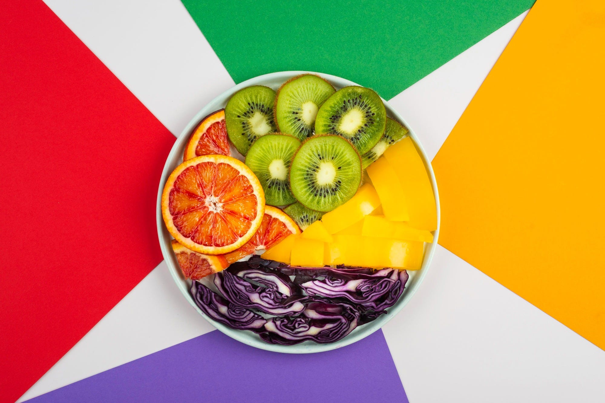
Did you know that 75% of avid restaurant customers choose where to eat based entirely on their evaluation of food photos?
Visual dominance is a critical commercial lever because an F&B image does far more than look appealing; it actively rewires how a guest anticipates and experiences flavour. By strategically altering the colour saturation of your marketing imagery and dishes, you can enhance a guest’s perception of your food and drink before they ever take a single bite or sip.
In this edition of Hospitality Marketing Insight we look at the exact cognitive link between visual saturation and sensory intensity, allowing you to engineer menus and plating that drive higher satisfaction and perceived value.
📄 On the Menu
The Power of Colour
How Does Colour Saturation Affect Flavour Perception?
The Instagram Expectation Trap
How Does Plate & Packaging Colour Influence the Taste of Food?
Let’s Check In ☕

🎨 The Power of Colour
Visual hue dictates baseline flavour anticipation before a diner ever reads a menu description. For instance, a study found that when orange juice was dyed to look like grapefruit juice, participants described it as having a grapefruit-like flavour.
Bright reds and greens can make a dish appear fresh and vibrant, while dark colours like black and blue can be perceived as unappetising due to their rarity in natural foods. Colourfulness plays a significant role in marketing salads, making them more visually appealing to consumers.
Colourful meals suggest they are likely to contain a greater proportion of vegetables, regardless of meal type.
But this isn’t the case globally; different cultures have different colour perceptions.
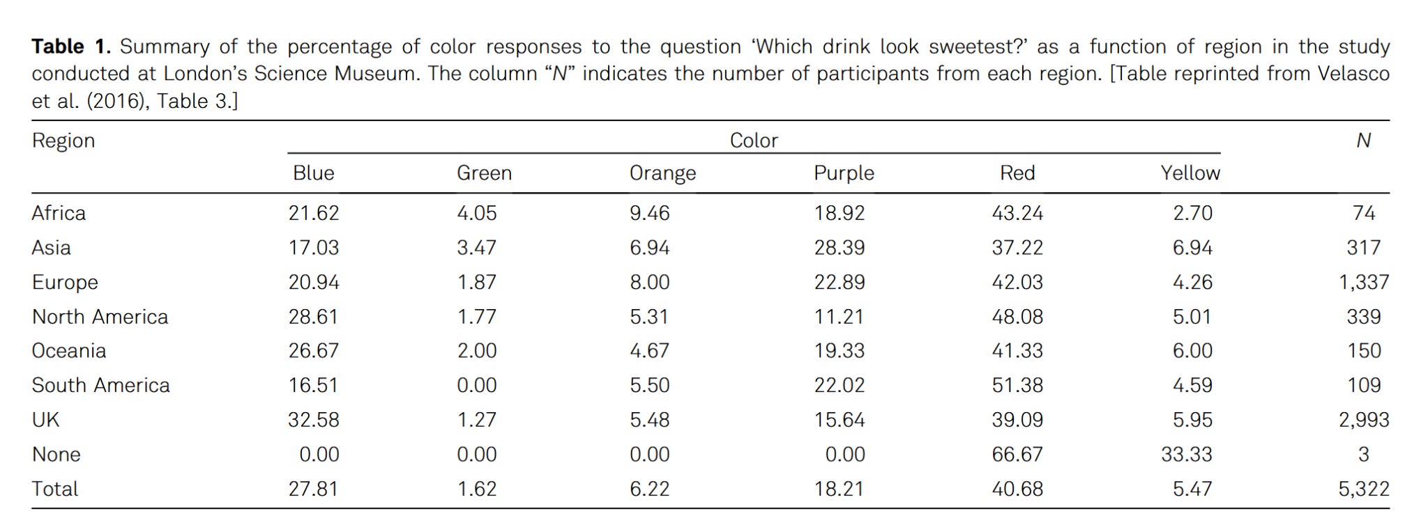
As the data illustrates, while red universally dominates as the colour most associated with sweetness across all global regions, secondary flavour perceptions vary significantly by geography. For instance, consumers in the UK and North America strongly associate blue with sweetness, whereas Asian demographics lean heavily toward purple. Base hue dictates what specific flavour profile a guest anticipates based on their cultural background.
However, once that baseline expectation is set, operators must consider how the vividness of that image amplifies the anticipated strength of the taste.
🌈 How Does Colour Saturation Affect Flavour Perception?
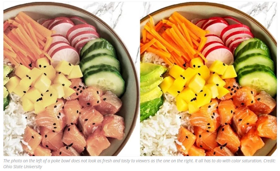
Higher colour saturation directly amplifies a diner’s expected flavour intensity, making food appear significantly fresher and tastier before it is even tasted.
When you increase this visual intensity, it triggers a cognitive mechanism known as psychological proximity. In plain English, vibrant colours trick the brain into interpreting the food as being physically closer to the viewer. This perceived closeness biologically heightens the anticipated sensory experience, meaning vivid imagery literally rewires the palate to expect bolder, sweeter, or sharper flavours.
Research demonstrates this effect in practice: when food photos were edited to be 130% more saturated, participants consistently rated the items as looking fresher and tastier, which directly increased their willingness to purchase the food.
Interestingly, this saturation effect is most powerful when the food appears further away in the photo; for close-up shots, the viewer can already easily imagine the freshness, making artificial colour boosts less necessary. Plus, the impact of high colour saturation is stronger for consumers who anticipate eating alone compared to those dining with family.
While amplifying saturation is a proven tactic to drive clicks on digital menu boards and delivery apps, operators must be careful not to overpromise. If visual cues establish an expectation of intense flavour that the physical dish cannot deliver, restaurants risk falling into the Instagram Expectation Trap.

⚠️ The Instagram Expectation Trap
When a restaurant fails to provide the exact item depicted in advertising, customers often react angrily.


Oversaturating food photography and unrealistic styling directly hurts restaurant reviews because it creates a false visual promise of bold, intense flavour that the physical dish ultimately fails to deliver.
In an attempt to capture attention, chefs and marketers frequently oversaturate imagery or add vibrant garnishes to delicate dishes. If the visual saturation promises a bold, intense taste but the actual profile is subtle, it triggers a negative expectation-disconfirmation. The guest will perceive the dish as bland or disappointing.
Professional food stylists note that oversaturated colours, unrealistic shine, artificial steam, or overly smooth textures remove realism and emotional connection. Ignoring colour harmony during the shoot and editing process is a major mistake; while warm tones should feel inviting and beverages should maintain freshness, poor colour correction can make food appear overcooked, dull, or unnatural.
The most effective restaurant photography maintains complete authenticity while simply enhancing visual quality.

🍓 How Does Plate & Packaging Colour Influence the Taste of Food?
Operators often assume the colour of the food itself is the only visual metric that matters, but research into packaging cues proves that the colour of the vessel whether it is a plate, a takeaway box, or a beverage cup heavily influences consumer attention and completely alters the perceived taste of the item inside.
For example, serving a dessert on a highly saturated red plate can artificially elevate the perceived sweetness of the dish without adding a single grain of sugar. This occurs because the colour of a plate actively primes associated concepts in the diner’s brain. Red plates are strongly associated with warmer temperatures and heightened sweetness, whereas blue plates are cognitively linked to a colder temperature.
An Oxford University study demonstrated that the contrast between a background colour and the food heavily influences how visually appealing a dish appears. White plates are frequently preferred because they provide a clean, neutral background for colourful foods, while dark plates are highly effective at enhancing the appearance of lighter-coloured dishes.
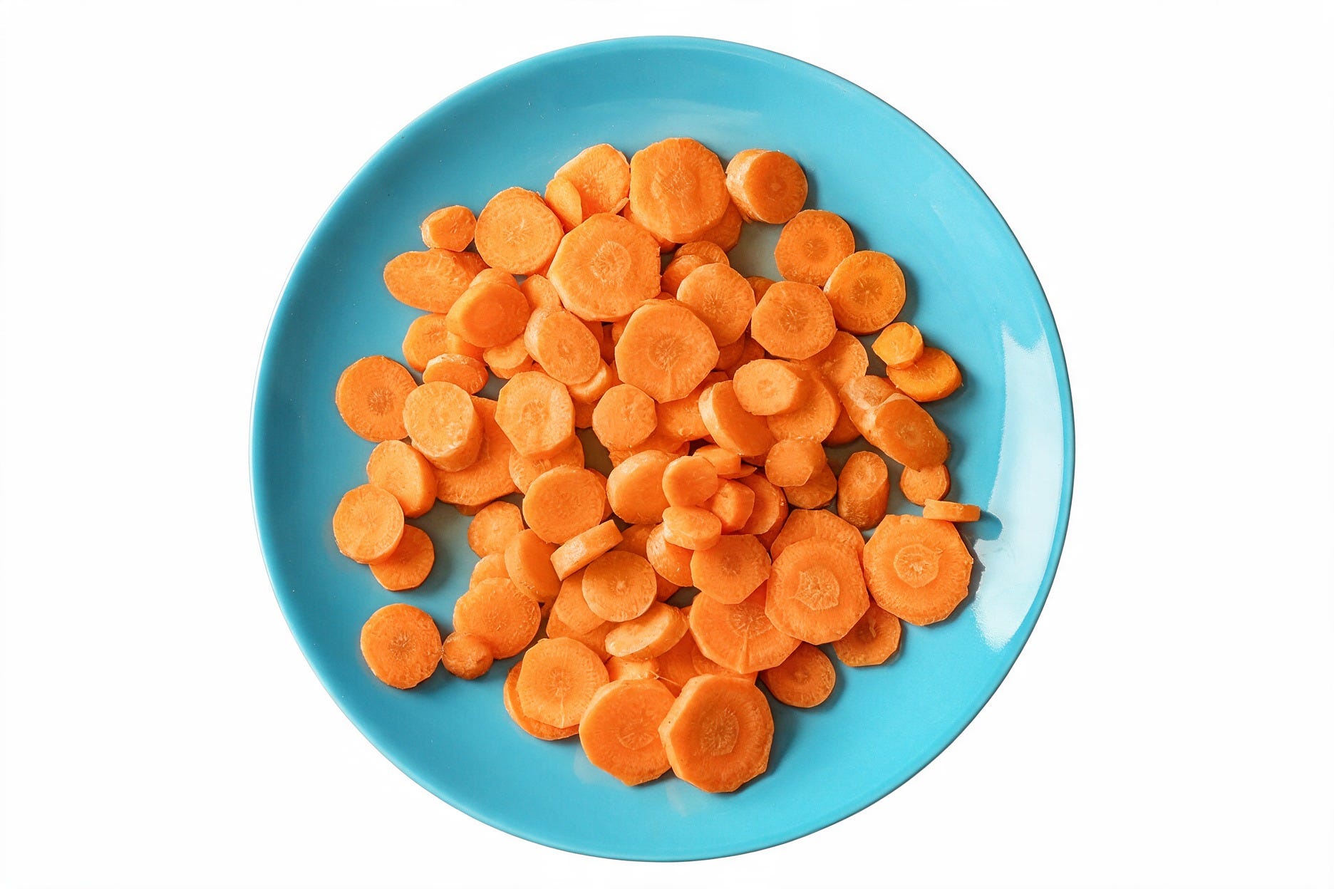
This interplay between food and its immediate surroundings also triggers contrast mechanisms that create illusory colours. Due to a phenomenon known as simultaneous contrast, the orange hue of a carrot appears significantly more intense to the eye when it is served on a blue plate.
This effect extends beyond dining plates into beverage packaging and glassware. A psychological phenomenon known as sensation transference dictates that consumers transfer their visual assessment of packaging directly to the flavour profile. When 15% more yellow was added to the green on 7Up cans, consumers perceived the drink as tasting significantly more limey and lemony.
Simply put, the colour of your plates and packaging sets the flavour expectations in the brain, changing how sweet or intense food tastes.

Want the plug-and-play tools to execute this strategy?
Upgrading to VIP gives you immediate access to our full strategy library - including over 100 consultancy-grade insights, from menu engineering frameworks and pricing calculators to review risk playbooks.
You can expense your subscription as a professional development resource.
You already know how to pull off a great service, but half the battle is won before the food hits the table. When your visual cues match what leaves the pass, you protect your spend-per-head and build serious brand loyalty.
Here’s to your success! 🥂
Dawn Gribble MIH MCIM
Hospitality Marketing Insight

I’m an award-winning marketing expert with 25+ years of international experience helping brands like Wagamama, Sysco, Ramada, and The Institute of Hospitality get clarity and creative insight on their marketing performance.
📊 Need an expert marketing audit? Get in touch at DG Consulting.
🚀 Grow your brand: Download courses, workshops, and campaign plans at the Hospitality Marketing Hub
📚 Sources & Resources
Cai, R., & Chi, C. G.Q., Pictures vs. reality: Roles of disconfirmation magnitude, disconfirmation sensitivity, and branding, International Journal of Hospitality Management (2021)
Gribble, D., 💡 The Role of Consumer Psychology in Hospitality Marketing, Hospitality Marketing Insight (2023)
Liu, S. Q., Wu, L. L., Yu, X., & Huang, H., Marketing online food images via color saturation: A sensory imagery perspective, Journal of Business Research (2022a)
Liu, S. Q., Wu, L. L., Yu, X., & Huang, H., Marketing online food images via color saturation: A sensory imagery perspective, Journal of Business Research (2022b)
Piqueras-Fiszman, B., Alcaide, J., Roura, E., & Spence, C., Is it the plate or is it the food? Assessing the influence of the color (black or white) and shape of the plate on the perception of the food placed on it, Food Quality and Preference (2012)
Spence, C., On the Relationship(s) Between Color and Taste/Flavor, Experimental Psychology (2019)
Stylist, J. F., Food Photography Mistakes: Top Errors Brands Make in Food Advertisements, jyotifoodstylist.com (2026)