

❌ The Menu Mistakes Draining Your Margins
A well-engineered menu can sharpen your brand and boost your bottom line without raising prices. Here’s how…

Your menu could be a stronger tool in your marketing arsenal. In fact, research from the Journal of Tourism and Gastronomy Studies shows that well-engineered menus can increase profitability by up to 15%. Yet most menus grow by default: inherited templates, rushed updates, or ‘something for everyone’ bloat.
This guide explains how to apply psychology, structure, and data-driven insights to turn a passive menu into a strategic growth driver. Whether you’re running a single venue or managing multiple sites, menu engineering can sharpen your positioning, reduce friction, and raise profit, without raising your prices.
Are you ready to maximise your margins?
Let’s Check In ☕
📜 Menu Engineering 101
Menu engineering is a strategic process which influences customer choices to drive profitability. Combining pricing psychology, strategic positioning, tactical messaging and graphic design, restaurants can optimise their menus to guide diners toward high-margin items.
Menu engineering goes hand in hand with creating a strong brand, and when done correctly, this strategy enhances both the customer experience and your bottom line.
In fact, the biggest menu mistake is not engineering.
But before you can guide diners toward high-margin dishes, you need a menu that doesn’t make them want to give up halfway through. That’s where many restaurants go wrong. They don’t have an engineering problem, they have an overwhelm problem.
🤯 How Menu Complexity Undermines Profitability
Although it's great to present people with choices, there's a point where it becomes overwhelming for some when presented with too many options.
Menus that feel cluttered or unstructured confuse diners and distract from your brand story. A menu overloaded with options can weaken the connection between the customer and your restaurant’s identity. Instead of choosing a high-margin dish, customers may gravitate to familiar, low-margin options.
I once worked with a cafe with over 200 items on its menu. Their idea was clear, something for everyone. But the result was a confused kitchen, slower service, and guests who couldn’t tell what the business stood for.
You need to know which items are pulling their weight. That’s where the Cost Margin Analysis Model comes in.
📊 Cost Margin Analysis Model
A well-placed, high-profit dish can do much more for your revenue than one that’s tucked away.
The Cost Margin Analysis Model assesses each dish based on its contribution margin in the late 1970s; this concept aims to help restaurateurs optimise their menus and enhance profitability by analysing both the cost and popularity of menu items. This dual focus allows restaurants to move away from guesswork and make informed, data-driven decisions.
First, you need to calculate the profit margins for each dish. Start by calculating each dish's Cost of Goods Sold (COGS), including the ingredients and supplies used to make it. COGS does not include overheads, staff costs, or other operating expenses like rent, utilities, or marketing.
Use this simple formula to calculate the profit margin for each dish:
Profit Margin = Selling Price - COGS
For example, if a dish costs £5 to make and sells for £20, the monetary margin would be: £20 - £5 = £15
If you prefer a statistical approach:
Profit Margin = (Selling Price - COGS) ÷ Selling Price × 100
For example, if a dish costs £5 to make and sells for £20, the profit margin would be:
(£20 - £5) ÷ £20 × 100 = 75%
This method allows you to track dish profitability over time.
Once you have calculated your margins, you can start categorising menu items within the Menu Engineering Matrix:

Stars: High sales and high-profit margins. These dishes usually have a profit margin of 60% or higher and are your top sellers. They drive revenue and should be promoted heavily.
Plough Horses: High sales but lower profit margins. These dishes typically have a profit margin of 30% to 50%. While they sell well, they may need a price adjustment or cost management to improve profitability.
Puzzles: High profit margins but low sales. These dishes have a profit margin of 50% or higher but sell less frequently. Consider promoting them more to increase visibility and sales.
Dogs: Low sales and low-profit margins. These dishes generally have a profit margin of under 30% and are low performers. These dishes may need to be reworked, re-priced, or removed from the menu altogether.
Your final matrix may look something like this…

In Leslie’s Cafe, dishes like Avocado Toast and Flat Whites sit in the Star quadrant—they’re profitable, popular, and brand-aligned. The Plough Horses, such as the Full English and Chocolate Fudge Cake, are beloved staples but costlier to produce. Items like Quiche Lorraine and Macaroons are Puzzles they carry good margins but don’t sell often, so their position needs rethinking. Then there are the Dogs, menu bloating items like Prawn Linguine or Spaghetti Carbonara, added in a panic to boost sales. They don’t fit the brand, rarely sell, and cost more than they earn. The more Dogs on your menu, the more they drag everything down.
Now that you’ve categorised your items, it's time to look at strategic menu design.
🔬 The Science of Menu Design
Effective menu design goes beyond aesthetics to guide diners’ choices, highlighting the dishes that drive profitability while ensuring an intuitive, easy-to-navigate experience. An effective menu layout can boost sales, speed up decision-making, and enhance the overall dining experience.
But before you start thinking about fonts and colour schemes, the first step is understanding how people read menus.
🤝 Grouping Items
Breaking decisions into smaller steps improves the customer experience. Instead of overwhelming diners with a long list of dishes, structuring choices into intuitive sections helps reduce cognitive load and speeds up decision-making.
Grouping dishes into categories like Brunch Favourites, Lighter Bites, or Sweet Treats gives diners a clear path to follow, making the menu feel simpler, even if the number of items stays the same.
When done well, chunking transforms your menu from a long list into a guided journey. Diners feel more confident, experience less decision fatigue, and are more likely to order with satisfaction.
Once your menu is logically grouped, the next step is guiding the eye, because how diners look at it shapes their choices. That’s where Gaze Motion Theory comes in.
👀 Gaze Motion Theory
Diners don’t read menus—they scan them. Eye-tracking research shows that most diners follow an F-shaped or Z-shaped scanning pattern. This means they start at the top left, sweep across, and then drop down the left or centre. These scanning patterns create natural hotspots—typically the top-left, top-centre, and bottom-right.
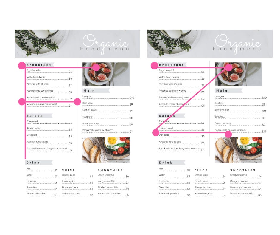
These areas are prime real estate for your high-margin or signature dishes, as they’re where diners’ eyes are most likely to land first. Placing your most profitable or standout dishes in these zones increases the chances of them being noticed and selected.
Avoid placing key items in areas that attract less attention, such as the menu's middle left or bottom centre. A profitable dish placed in a low-attention zone won’t get ordered as much, no matter how great it is. Your menu layout should guide the eye as deliberately as your front-of-house team guides the guest experience.
Cultural Considerations
When designing your menu, it’s essential to consider the reading styles of different cultures. For diners who read from right to left, such as those from Arabic or certain Asian cultures, the F-shaped or Z-shaped patterns will be reversed.
In these cases, you should place key items in the top-right, top-centre, and bottom-left areas to accommodate the natural flow of their reading pattern. A well-considered design that respects these differences ensures a seamless experience for all guests.
Once you understand how diners scan a single page, it’s time to apply that logic to multi-panel layouts. Whether your menu folds in half, thirds, or more, each panel draws a different level of attention, and smart placement can turn passive panels into high-performing sales zones.
📄 Panel Placement
In a two-panel layout, the right-side panel typically draws the most attention, while the left side is less focused. The three-panel menu follows a similar pattern, with the third panel being the most engaging. For menus with many panels, the top of each page grabs the most attention, with the least focus given to the lower sections of each panel.

Placement within each section matters as much as overall positioning. That’s where the primacy and recency effects come into play, because diners remember the first and last things they see.
🧠 Primacy & Recency Effect
Diners focus on the first and last items in any menu section, a behavioural bias known as the primacy and recency effects. The first item captures immediate attention; the last benefits from a final pause. These are prime positions for high-margin, high-desire dishes.
Middle items often blur into the background unless visually emphasised, so placement alone won’t do. Use bold text, subtle callouts, or contrast carefully to anchor attention without overwhelming the layout.
If everything stands out, nothing does.
Now that you’ve identified your high-margin items and grouped them, here’s how to apply primacy and recency within each section:
Start strong: Open each category with a reliable performer—something with broad appeal, high profitability, or strong brand association.
End memorably: Place a second high-margin dish at the end. This can be a signature item, an indulgent upgrade, or a seasonal special.
Hide your fillers: Place low-margin or utility items in the middle. They remain accessible without stealing focus.
Support the centre: If you must include a dish mid-section, draw the eye with a single, restrained visual cue—like an icon, chef’s note, or soft background tint.
Segment longer lists: For sections with more than six items, break them into sub-groups. This resets the primacy/recency effect and gives you more opportunities to feature top dishes.
Test and refine: If a high-margin dish isn’t selling despite good placement, review how it’s described and displayed. The position draws the eye, but the copy closes the sale.
💰 How Price Placement Influences Buyer Behaviour
Once you’ve structured the decision path and guided the eye, the next layer to consider is the price, because how it's positioned changes how it's perceived.
📍 Price Placement
Where the price appears on the menu significantly influences how diners make choices. When prices are listed in a separate column or placed far from the dish name, they become a visual barrier, prompting diners to compare numbers rather than dishes. This often leads to second-guessing or, worse, defaulting to the cheapest option.

Instead, keep the price close to the dish name to present it as a complete offer. For example:
Patatas Bravas | £6.00
Chorizo al Vino | £7.50
Piquillo Peppers | £8.00
Croquetas de Jamon | £6.50
Gambas al Ajilo | £9.00
This keeps the focus on the food, not the price tag, and encourages diners to engage with the dish itself rather than focusing on its cost.
⚓Price Anchoring
Price anchoring works by using one item to make another look like better value, helping guide diners to the option you want them to choose.
For instance, placing a high-margin £18 pasta next to a £24 seafood special makes the pasta appear more affordable.
However, avoid placing that same £18 pasta next to a £14 risotto. In this case, the risotto becomes the anchor, making the pasta look overpriced and shifting focus away from the more profitable dish.
Anchoring only works when the comparison is deliberate—get it wrong, and you risk drawing attention to the wrong dish.
🎭 Decoy Pricing
Decoy pricing shifts buyer perception, nudging customers towards higher-margin options without direct price hikes. You’ll see this used in most coffee shops.
Here, the Medium Coffee acts as the decoy. While the Small Coffee is £2.50, the Medium Coffee at £4.00 feels overpriced in comparison, especially considering the Large Coffee is only 50p more. By placing the Large Coffee at £4.50, the price difference between the Medium and Large makes the Large Coffee look like the better value.
The Medium appears to be an unattractive option now, and customers are more likely to opt for the Large, which brings in a higher margin for the business. The decoy is strategically priced to push customers toward the more profitable choice.
🔄 Currency and Rounding
The classic .99 ending is used in retail to create the illusion of a bargain. For example, £9.99 feels closer to £9 than £10, even though the difference is minimal.
In hospitality, removing this can help position your menu as higher-end, appealing to diners who associate rounded figures with quality and premium experiences.
Many premium venues remove currency symbols and use rounded numbers instead, such as changing “£17” to just “17.” This simple change can signal confidence, elevate perceived value, and align with a more refined brand experience.
Patatas Bravas | 6
Chorizo al Vino | 8
Piquillo Peppers | 8
Croquetas de Jamon | 7
Gambas al Ajilo | 9
Once your pricing is positioned to support value perception, the next step is knowing which dishes to pull back from. Not every item deserves the spotlight—and that’s where demarketing becomes a strategic tool.
📈 Optimising Digital Menus
Most digital menus are treated like PDFs with a scroll bar. That’s a missed opportunity. A well-structured digital menu adapts to guest behaviour, improves clarity, and supports your most profitable items, without adding noise.
Digital menus offer more than cost savings; they provide control and flexibility. They allow instant updates, faster feedback loops, and limitless testing, making it easier to fine-tune your offerings in real time.
Research from QSR Magazine shows that digital menus can increase sales by up to 10%. Today’s diners expect flexibility, clarity, and personalisation—expectations that static menus no longer meet. A well-designed digital menu keeps up and adapts to these needs, guiding customers to your most profitable dishes.
However, many restaurants make the mistake of treating digital menus like static PDFs, simply uploading a document instead of crafting a dynamic tool for growth. To optimise your digital menu, you must understand how customer behaviour shifts in this format and how to use it to your advantage.
🚶 How Behaviour Changes with Digital Menus
As customer behaviour shifts in the digital environment, so should your menu design approach. Understanding how diners interact with digital menus lets you optimise the user experience and effectively guide purchasing decisions.
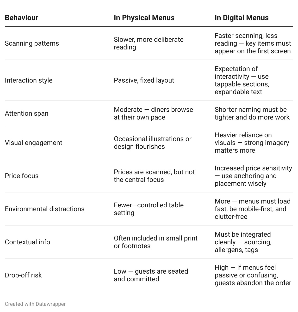
Digital menus should be crafted with the same care and consideration as printed ones, but with a clear understanding of how behaviour changes in this new format. They should be designed to engage diners quickly, with intuitive navigation, interactive elements, and a strong focus on guiding decisions.
📉 Demarketing
Demarketing is a strategy used to reduce demand for certain dishes to make room for more profitable options.
5 Ways to Demarket Low-Margin Dishes
Move low-margin items out of visual hotspots, such as the top or bottom sections of the menu.
Remove words that inflate the appeal of low-margin dishes. Terms like “special,” “signature,” or “chef’s choice” create false value and should be avoided. Instead, tone down the description, place the item below a divider, or label it as limited or seasonal to reduce its pull.
Use scarcity cues like “limited availability” or “seasonal special” to subtly shift diner expectations. These phrases signal that the dish may not always be available, which lowers demand without devaluing the item. Scarcity reframes the dish as an occasional option rather than a core feature, reducing repeat orders while maintaining a perception of quality.
Remove low-margin dishes from delivery apps like Uber Eats or Deliveroo, where they are less likely to generate substantial profit.
Avoid promoting low-margin dishes in your digital or print marketing efforts; focus on high-margin, star items.
A leaner, clearer menu reduces decision fatigue, making diners feel more confident and less overwhelmed.
Demarketing works best when paired with strong promotion of your high-margin dishes. By drawing attention to the dishes that contribute the most to your profit, you guide diners towards choices that benefit them and your restaurant.
♿ Accessibility and Languages
Digital menus offer advantages that printed ones can’t, instant translation, screen-reader compatibility, and adjustable font sizes. These features reduce misunderstandings, especially around allergens or special requests. A multilingual, mobile-friendly menu broadens appeal and supports a smoother experience for international guests, neurodivergent diners, and anyone with visual impairments.
"Web content must be accessible to people with a wide range of physical and mental abilities." — Web Content Accessibility Guidelines
Accessibility & Language – Do’s and Don’ts
✅ Do:
Offer key languages based on your service area demographics
Include alt text for all images, especially for dish photos and icons.
Use legible fonts that scale clearly across devices.
Ensure a strong colour contrast between text and background.
Label allergens clearly, using both text and icons.
Use plain, concise language—especially in translated copy.
❌ Don’t:
Don’t rely on PDF menus unless they are fully tagged and structured for accessibility. Most PDF menus are not screen-reader friendly by default, especially if they’re image-based or scanned documents. Unstructured PDFs cannot be navigated by assistive technologies, making them inaccessible to many users.
Don’t rely on automatic translation without reviewing it; it can lead to awkward or incorrect meanings.
Don’t use pale grey text on white or tiny font sizes—this frustrates guests with visual impairments.
Don’t embed important info (like allergy details) in images—it won’t be picked up by assistive tech. Always provide important content as live text in the menu layout, and supplement decorative or supportive images with descriptive alt text where needed.
Don’t assume one-size-fits-all—test your menu on both iOS and Android devices.
⚡ Neuromarketing
When your digital menu is designed with neuromarketing principles, it guides your diners’ choices and increases revenue. To prevent people from leaving your digital menu, use these tactics:
Micro-animations and transitions to engage diners can increase interaction by 30%. These visual cues tap into subconscious emotional triggers, keeping diners focused on the menu and encouraging them to explore higher-margin items. This engagement enhances the dining experience and strengthens brand recall by creating a more immersive, memorable interaction. When diners have a positive experience with intuitive design, they are more likely to associate your restaurant with ease and satisfaction, leading to stronger customer loyalty.
Progress bars activate the brain’s reward system, motivating diners to finish their orders. This simple feature has been shown to increase order completion by 10%.
Sensory-rich imagery (images featuring taste, smell, or texture) evokes emotional responses that make dishes more desirable. Sensory-driven images can increase dish selection by 20%.
Studies show that diners focus on the top-left corner of the digital menu. Placing high-margin dishes here ensures they’re noticed, driving higher sales. Digital menus can also provide real-time feedback through eye-tracking and buyer data, allowing you to optimise the layout based on diner behaviour continuously.
💲 Dynamic Pricing
Digital menus can allow you to adjust prices in real time based on demand, time of day, or stock levels. This is known as dynamic pricing. One form, surge pricing, increases prices during peak periods, helping you maximise revenue when footfall is highest.
London’s Bob Bob Ricard implemented a dynamic pricing model, offering 25% discounts during off-peak times and 15% during mid-peak periods to attract more customers. Similarly, Stonegate Group, the UK's largest pub chain, introduced a 20p surcharge on pints during peak hours across approximately 800 locations to cover additional operational costs.
However, dynamic pricing, especially surge pricing, can backfire if handled incorrectly. When Wendy’s announced it was trialling AI-powered pricing on its digital menu boards, the backlash was instant. Headlines claimed prices would rise during busy times, and customers reacted with frustration. Wendy’s had to clarify publicly to reassure diners it wasn’t surge pricing. The lesson? If you’re not clear, diners will fill the gap, and you may not like the story they tell.
⚠️ Pitfalls of Digital Menus
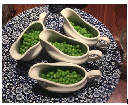
While digital menus offer flexibility and speed, many diners dislike them and prefer the tactile experience of a paper menu. Digital-only options can feel impersonal or disconnected and open the door to misuse, especially from pranksters.
For instance, in Wetherspoons, students used the digital app to prank the restaurant and its patrons by ordering excessive orders of peas for other diners. This kind of prank disrupts service, wastes resources, and distracts from the dining experience.
📱 Phygital Menus - The Best of Both Worlds
Phygital menus combine the clarity of print with the adaptability of digital. By integrating QR codes into a well-designed print menu, you keep the tactile experience guests expect while offering the option to explore additional details on their own terms. Those who want simplicity can stay with print. Those who want depth can scan.
Phygital menus also offer the chance for smart, ethical transparency. You can use the digital component to share your sustainability practices, local sourcing efforts, and employment opportunities. Customers today value transparency and want to know more about where their food comes from and how it’s produced.
A study by YouGov revealed that 68% of Gen Z consumers are driven by sustainability concerns, with a strong desire for clear information about food sourcing and environmental impact.
You can fine-tune your printed version more accurately by analysing how guests interact with your digital menu. Tracking which dishes draw attention allows you to adapt quickly to changing preferences. This feedback loop keeps your offer current, focused, and profitable. Phygital menus strike the right balance, offering adaptability without losing the tactile connection your guests still expect.
A word of caution: QR codes must be secure. Use verified platforms and check your physical menus regularly for tampering; stickers that redirect guests to fraudulent sites are increasingly common. Several restaurants have had to replace compromised codes after diners were sent to fake menus or phishing pages. Protecting your digital and physical touchpoints is essential to maintaining trust and safeguarding your brand.
⭐️⭐️⭐️⭐️⭐️
A well-engineered menu doesn’t just increase profitability, it communicates who you are, what you value, and how you operate. Every design choice shapes perception and drives decision-making, from pricing psychology to digital behaviour patterns.
Whether refining a single printed layout or rolling out phygital menus across multiple sites, the principles stay the same: remove friction, guide attention, and align your offer with what today’s diners want.
Your menu is one of the most powerful tools you have for increasing profit. Treat it like it matters, because it does.
❓ Got a question about this issue?
If something in this issue raised a question or touched on a challenge you're facing, ask in the comments below. I bring 20+ years of hospitality marketing experience to every answer.
📅 Coming Up
Christmas is closer than you think. In the next issue, we’ll reveal the 2025 trends you can’t afford to miss. From early bookings to the rise of digital gift cards, this guide will help you shape a strategy that positions your brand ahead of the competition and drives real results. Prepare for the season now.
📚 Recommended Resources
BBC News. “Organised Crime Gangs behind Rise in QR ‘Quishing’ Scams.” BBC News, (2025).
D’Innocenzio, Anne, and David Hamilton. “Wendy’s Gulps Back Surge Pricing Idea as Complaints Expose Limited Tolerance for Floating Costs.” Los Angeles Times, (2024).
Gansser, Kristina. “Using Menu Engineering to Drive Greater Profits in Your Restaurant — Fourth.” NOAM, (2023).
Journal of Tourism and Gastronomy Studies. “Menu Engineering in the Restaurant Business.” ResearchGate, (2025).
Lightspeed. “Menu Engineering: How to Make a Profitable Restaurant Menu.” Lightspeed, (2025).
Merckaert, Geert. “Menu Engineering: A Proven Strategy to Increase Restaurant Profits.” Apicbase, (2024).
Reddit. “Restaurant Owners - How Much Would You Pay for a Menu?” Reddit Post, r/Restaurant, (2023).
“Visited a Pub and Hated Their Menu. Made My Own for Them. Tell Me What You Think.” Reddit Post, r/Restaurant, (2024).
“What Is the Most Difficult Part When Creating a Menu?” Reddit Post, r/Restaurantowners, (2023).
The Packer. “Survey Finds Gen Z Hungry for Transparency in Food Sustainability.” The Packer, (2024).
Toast. “What Is Menu Engineering? Boost Your Menu Items’ Profit and Popularity Using Restaurant Menu Design.” (2025).
Wetherspoon App Sees People Take the Peas and Really Milk It - Plymouth Live.” (2025).